

Realistic CSS Animations and the linear() Timing Function! 🍱
Realistic animations are now closer than ever with the new linear() CSS easing function.

Hi everybody - When it comes to creating realistic animations, a crucial element is the various accelerations and decelerations that make up the animation’s behavior:

We define these accelerations and decelerations in our web animations by defining what are known as timing (aka easing) functions. If you aren’t familiar with what these are, take a quick five-minute detour and take a look at my Timing Functions in CSS article.
In the following sections, let’s look at an exciting new development that has happened in the timing functions world! 🥳
Brief History Lesson
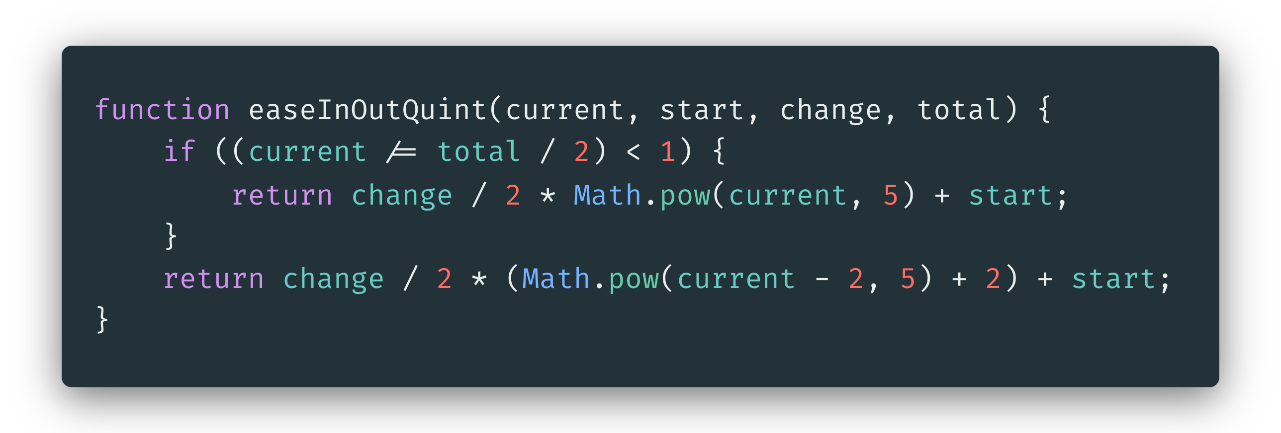
For animations created in JavaScript, a timing function is just code. There are no limitations to how elaborate our timing function can become, and there are many prebuilt libraries of timing functions that we can use, such as the infamous Penner Easing equations (JS-only code):
For animations created in CSS, the breadth of timing functions available was limited. The most we could do is represent a timing function using a cubic-bezier function. A cubic-bezier function was not expressive enough to represent the more realistic accelerations and decelerations our animations would have needed.
To work around the CSS limitations, we had two options:
Define our animations entirely in JavaScript, bypassing the simplicity of CSS
Use the built-in timing functions and sacrifice the realism that we may have wanted our animations to exhibit
Neither of these were desirable options, but that is the best we could do. There were a few false starts to address this over the years such as Safari prototyping a spring easing function, but none of it really hit mass adoption. That is until now.
Meet the linear() Timing Function
Introduced recently, the linear() timing function gives you and I nearly full control in defining every detail of how our timing function needs to behave. For the full rundown on what the linear() timing function is and how to use it, this article from the Chrome team is fantastic.
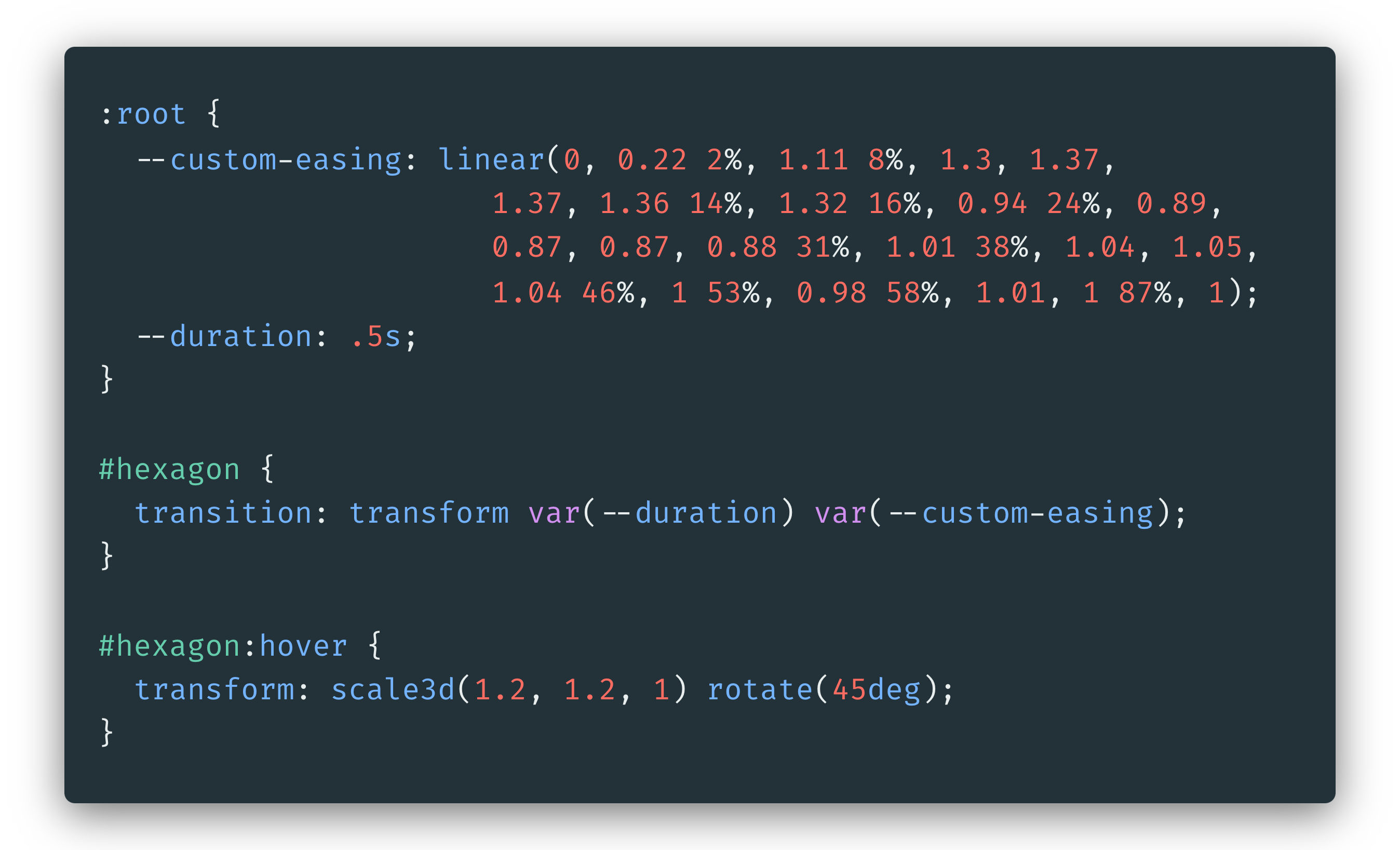
The TL;DR is that we can pair our CSS animations and transitions with a timing function that can give us realistic accelerations and decelerations. This means, we can create a hover effect with this cool kinda bounce using only CSS (see live version):

The linear() timing function values that make this bounce effect work look as follows:
At this moment, you are probably wondering how one generates all those strange decimal values and percentages (aka stops)? The linear easing generator can help here, and we’ll likely see more tools coming out in the future that make generating these stops even easier.
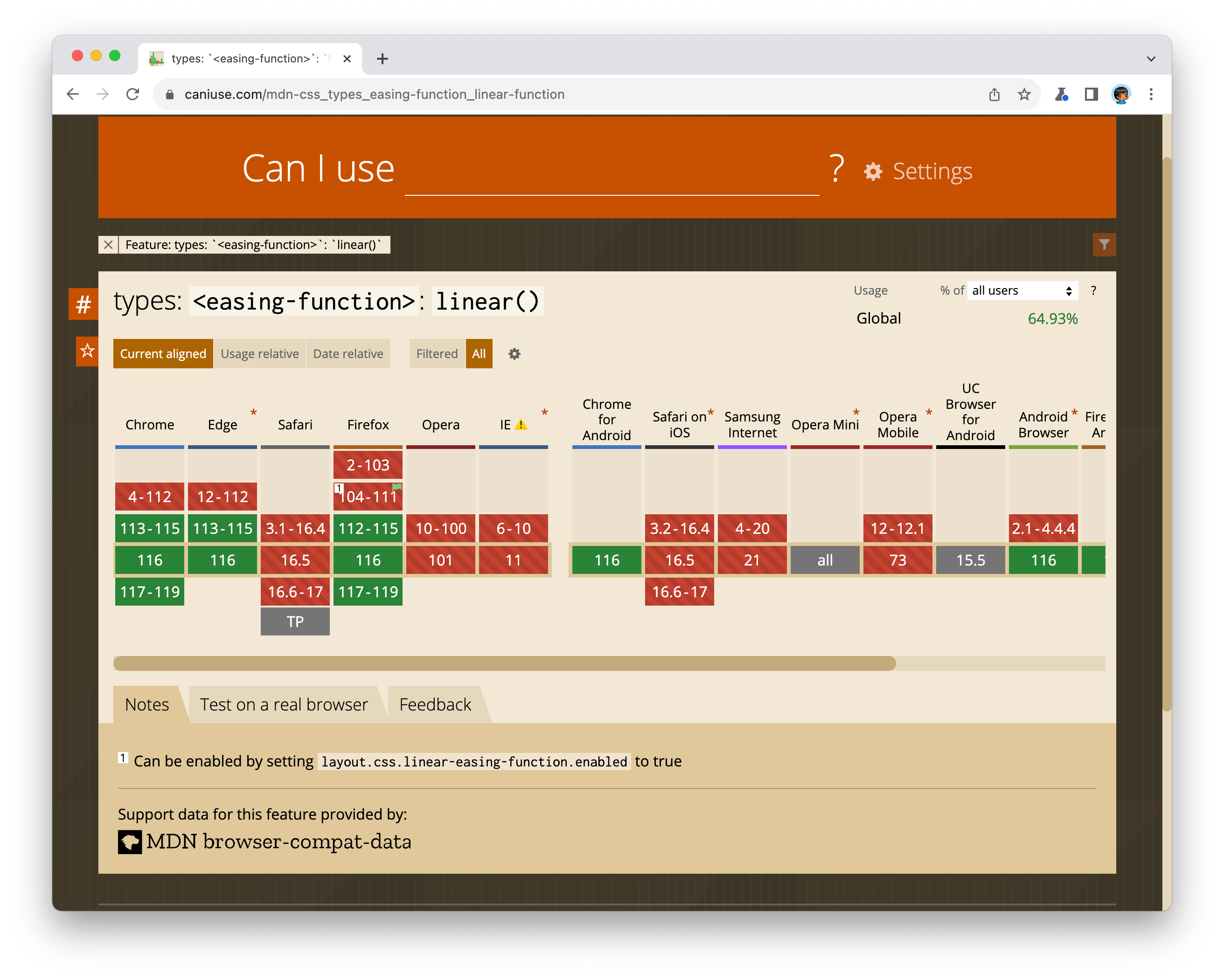
Can I use linear() today?
Browser support for the linear() timing function is…

Chrome, Firefox, and Chromium-based browsers like Edge support it. Safari (and all browsers on iOS) don’t support the linear() timing function yet, so we need to provide adequate fallbacks:
I created a short companion post where I highlight how to use the linear() timing function with a fallback cubic-bezier() function for those browsers that don’t support it. Definitely take a look at that.
Till Next Time
I feel like more has happened in the last year in advancing the state of web animation forward than there has been in the past five years combined. These certainly are some fun times, so look forward to more animation-related items getting mixed in with the regular dose of content you see.
If you want to reach out to me, reply to this newsletter, ping me on Twitter, or go to the forums like the good old days.
Cheers,
Kirupa 😁
I just started using 3d glasses with my iPhone camera and video . I am interested in working the 3d images into painting. Any ideas?