

Hi everybody - I just launched something I have wanted to make for a very long time. It's called KIRUPAicons, and it's a collection of nearly 2,000 icons drawn in five different styles. That adds up to nearly 10,000 icon variations!
The quickest way to see them is this short video:
Before I go further…
I can use your help. Please help signal-boost KIRUPAicons by liking, reposting, or sharing my Twitter / X post and LinkedIn post about it with your networks.
Every little boost helps these icons find their way into more blogs, slides, and side projects. It also keeps my ego fed on its usual schedule! 😅
One Icon, Five Ways
Every icon in the collection comes in five styles: Pixel, Sci-Fi, Minimal, Ukiyo-e, and Smooooth (yes, with four o’s). The best way to see what that means is to pick one subject and look at every version of it. Here is our fox:
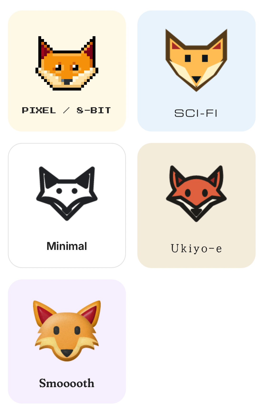
What makes this fun (for me, at least) is that each style plays by its own set of drawing rules:
The Pixel fox is built from hand-placed pixels on a tiny 24 pixel grid.
The Sci-Fi fox is all angular shapes and heavy outlines.
The Minimal fox is one-color line art, so it works on both light and dark pages.
The Ukiyo-e fox borrows the woodblock ink and muted pigments of Japanese prints.
The Smooooth fox starts from the Pixel drawing and traces it into soft curves, which is why it looks like the Pixel fox’s more relaxed cousin.
To see those rules up close, here is the Pixel fox blown up so you can see every square on its 24 × 24 grid:
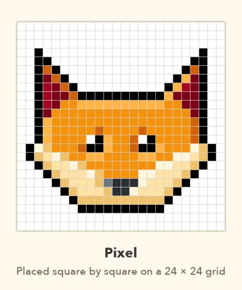
Every square in the Pixel fox is there on purpose, and there are only 576 of them to work with.
Now, multiply that fox by every face, person, animal, food, place, activity, object, symbol, and flag. Here is one icon from a bunch of those categories, drawn in every style:
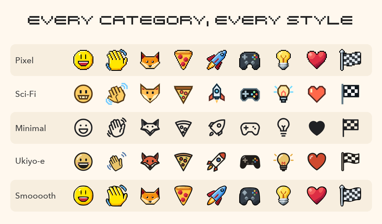
That is how we get to nearly 10,000 icons, and every one of them has to look like it belongs with the others in its style.
Every PNG is free for personal and non-commercial projects, as long as you credit “Icons by kirupa.com.” If you need the SVG source files or want to use the icons in commercial work, KIRUPAicons Pro is a one-time purchase.
Go browse the galleries, search for your favorite animal, and see which style you like best.
Why I Made These
I have always loved icon design. I have also been a collector of icons for as long as I can remember. There is something about a tiny square that has to get a whole idea across at a glance that never stops being interesting to me.
What pushed me to go all the way was the theme picker. A few weeks ago, I added a theme picker to kirupa.com that lets you switch the entire site between six different styles (I talked about it in this earlier video). The fonts, the buttons, and even the spinning Who’s Online globe change with the theme.
Building those themes is where the icons crept in. The site has always been full of small pixelated icons, and they look right at home in the Pixel theme. In the softer, rounder themes, they stuck out. A pixelated lightbulb sitting next to a book callout looked very…out of place. So each theme needed icons drawn to match it. Here is what the top of the site looks like in four of the themes today:
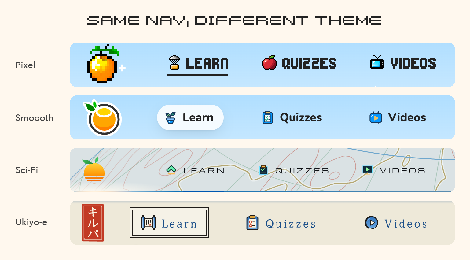
The Learn, Quizzes, and Videos icons change right along with the fonts and colors.
Once I had a handful of icons redrawn for each theme, I wanted to go all the way and draw the full set in every style. This is where things got really interesting.
This Wasn’t Fire and Forget
I want to be clear about one thing. I didn’t type “make me 10,000 icons” into an AI, go to bed, and wake up to a finished gallery. I tried that. The results were just terrible! AI agents did a lot of the drawing, but getting icons that you and I would be happy with was a tall order.
I had to teach the agent what a good icon looks like in each style. That meant explaining what makes a pixel icon readable at small sizes, when an outline should be heavy and when it should get out of the way, how a woodblock print handles color, and a whole lot more. When an icon came back wrong, fixing that one icon was the easy part. The harder (and more useful) part was figuring out why it went wrong and turning that into guidance the agent could apply to every icon after it.
Till Next Time
I hope you get as much enjoyment and utility out of using these icons as I did when I created them for the various themes on the site.
Now, which of the five styles would you pick for your next project? And if there is an icon you wish existed but can’t find, let me know. Reply to this email, post on the forums, or find me on Twitter / X.
Cheers,
Kirupa 🦊