Dark/light themes: auto-switch or give users the choice? 🗳️
These days, whether we are on a mobile or desktop device, we have the ability to choose between a dark theme or a light theme to change how almost everything looks from a color point of view:
macOS's theme switcher!
This wasn’t always the case. For the longest time, our operating systems were optimized for just one mode or the other. To give us the ability to choose between dark mode and light mode, operating systems (OS) like macOS, iOS, Windows, Android, etc. all did a monumental amount of work to ensure all of the various UI elements that one would see looked great across either of the two modes.
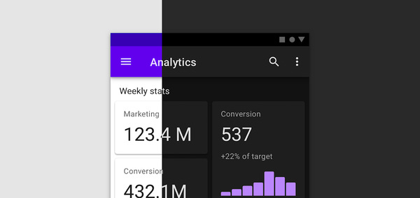
The following image is an example of Android’s UI showing how it looks in both dark mode and light mode:
Dark and Light theme in Android
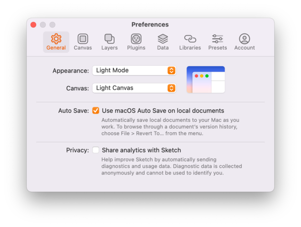
Third party developers weren’t too far behind. To ensure their apps didn’t look inconsistent with the rest of the OS, third party apps began to follow suit and provide proper support for dark and light themes as well:
Sketch is one the many 3rd party apps that provide theming capbailities
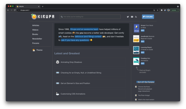
Last and certainly not least, once the JavaScript APIs for detecting whether the underlying operating system is in dark mode or light mode became available, many web sites began to offer a version of their content optimized for dark mode or light mode as well:
Today, we have reached a point where, whether you are using apps locally on your device or browsing the web in your browser, your operating system preferences for dark mode or light mode carry over and impact whether the visuals you see in your apps and sites are consistent.
Force consistency or give users the choice?
Let’s get straight to the point here. Many apps and sites today automatically switch you into a visual mode that is consistent with your operating system settings.
Focusing just on web sites and apps: Is this the right design choice? As a developer, are there cases where auto-switching your web UI elements based on operating system theme preferences is the wrong thing to do?
I’m sure by now you’ve seen examples where forcing consistency automatically results in a nice output:
Github's dark mode automatically gets applied based on OS settings
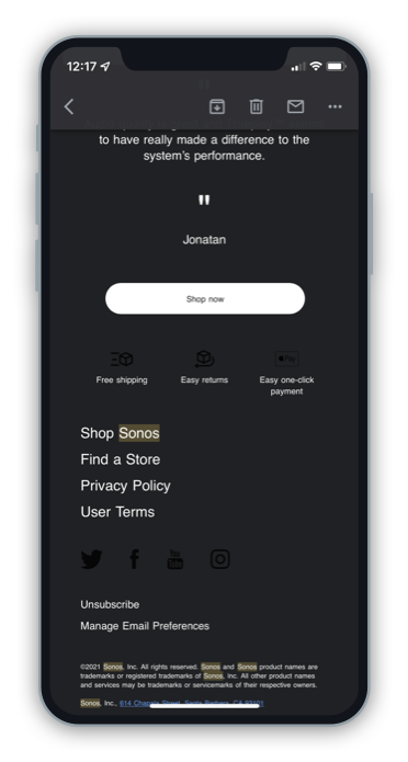
I’m sure you’ve also seen examples where automatically switching your colors for consistency leads to some…odd results:
Notice that the original dark content is unreadable!
Where do you stand on this? I’m planning on writing a more detailed article in the future that dives into the pros and cons of auto-switching, but please do chime in on a Twitter poll I created to get all of your collective takes on this issue:
QQ: Should web sites automatically adjust their colors to match your OS dark mode (🦇) / light mode (☀️) settings?
#ux #ui #webdev
Again, do vote in this poll and leave a comment as well. I’m curious to hear your thoughts and dive into this fun topic with you all further!
Cheers,
Kirupa 🥳
In order to unsubscribe, click here.
If you were forwarded this newsletter and you like it, you can subscribe here.
Created with Revue by Twitter.


